Project Canale
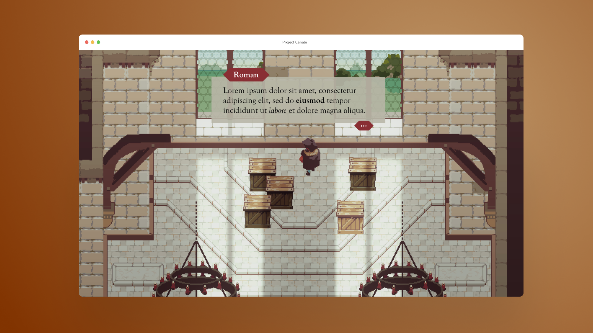
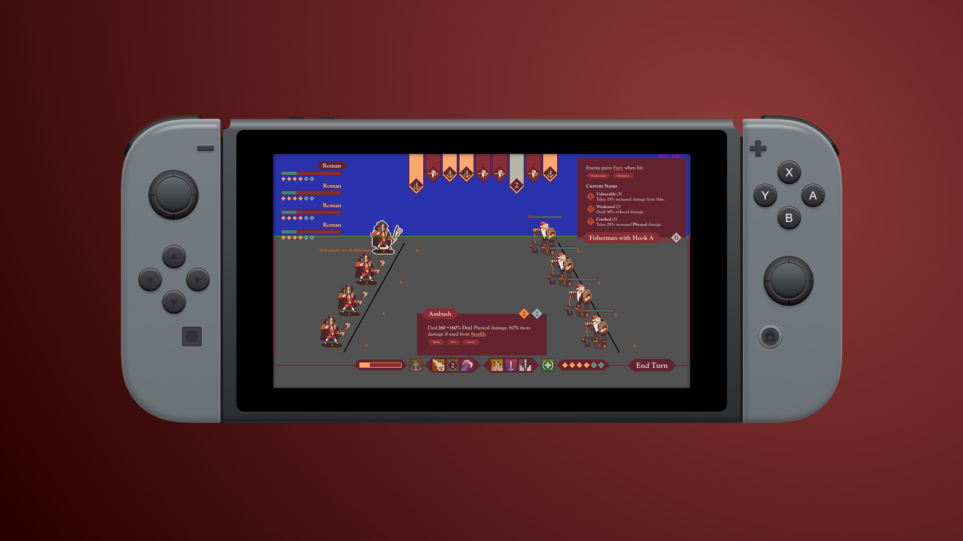
Unsaturated Colors in a Saturated Market
A friend from when I was in college – we had both worked on indie video games in a niche game engine back in 2016 – reached out to see if I was interested in working on a new project he and his team was creating: Project Canale.
The team wanted a user interface that would set them apart in the indie game scene, which was dominated at the time with black and grey gradients and white sans-serif text. As the game was set in a fantasy equivalent of Renaissance-era Italy, I pulled colors from the pixel artist’s palette and inspiration from old manuscripts to find my fonts and shape language.
The dark burgundy used in the combat scene emphasized the feeling of refined violence, while the ivory used in dialogue and menus brought a calmer, more academic feel for those screens.